Copium
My task was to design a non-alcoholic drinks brand, targeting young adults. The purpose of the brief was to explore creative branding ideas.
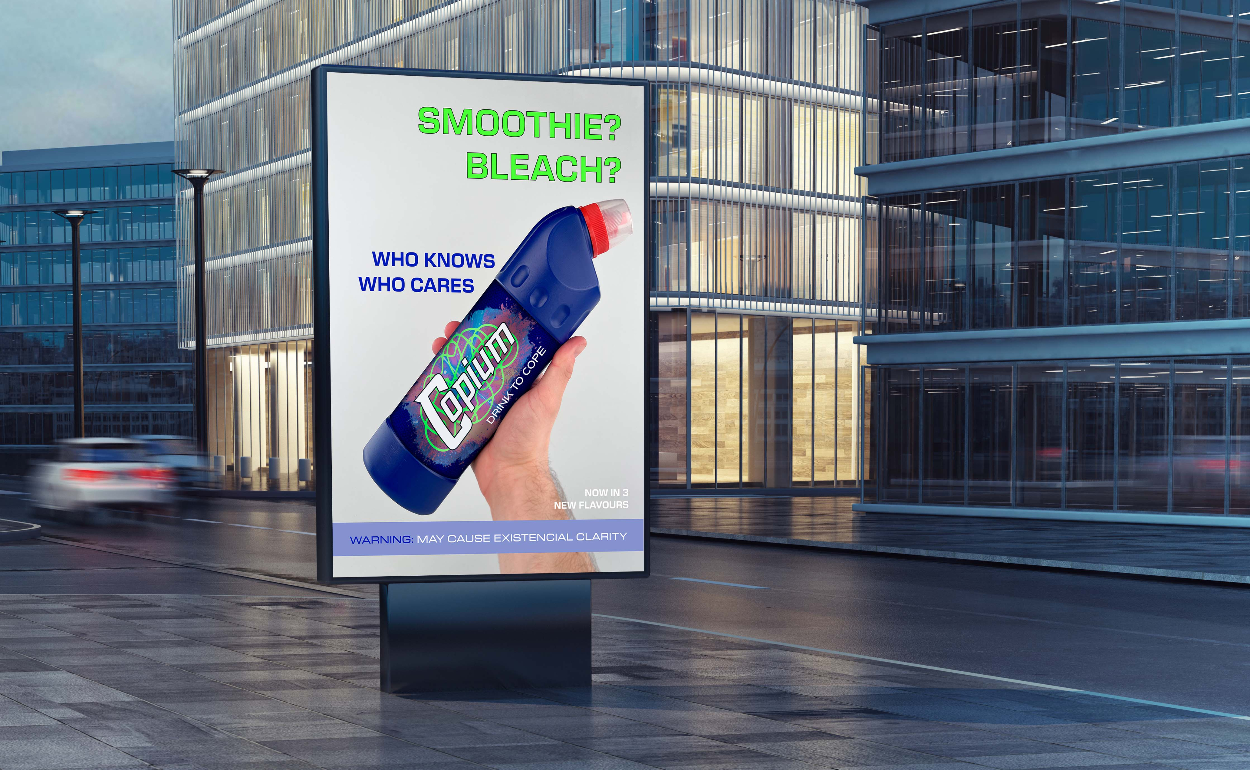
Inspired by meme culture and healthy eating, the idea is centred around selling a fruit smoothie in a bleach bottle and marketing it as “Copium” - a satirical remedy for coping.
The branding works by creating strong visual associations to bleach in its packaging, thanks to the use of layout and shape of a Domestos bottle. These associations combined with a fresh logo design, come together to create a striking brand which, not only captivates, but also, through its satirical nature and healthy content, helps the consumer cope.
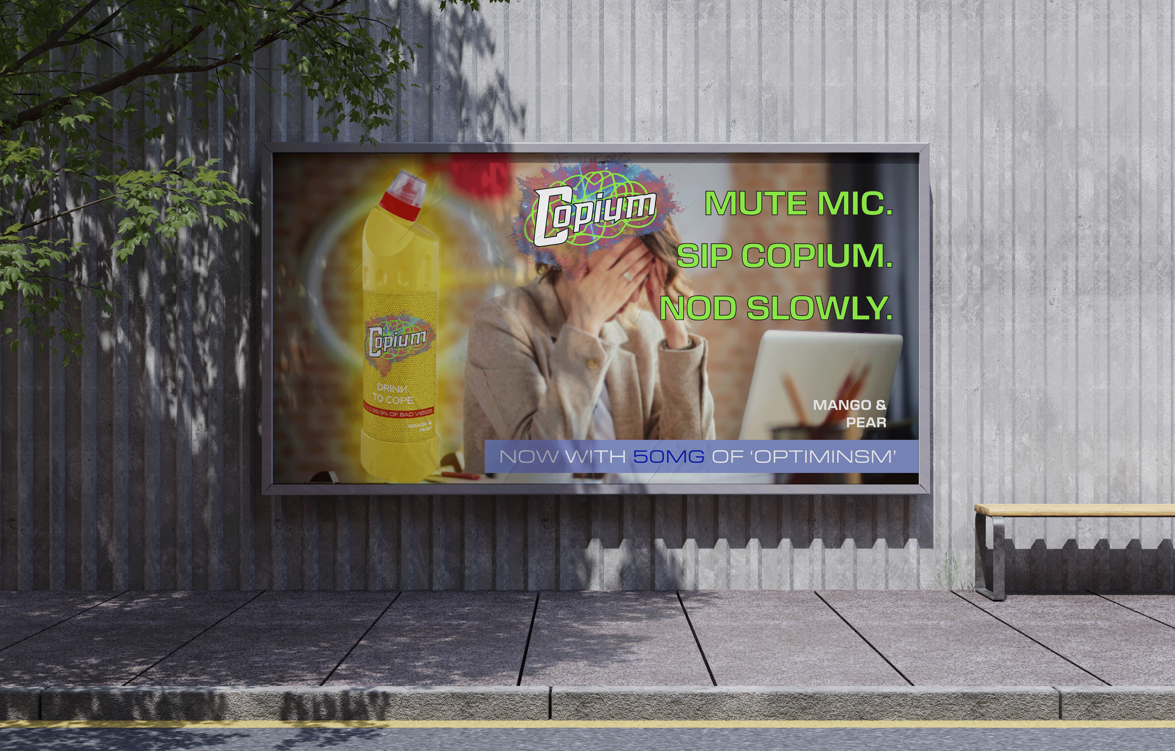
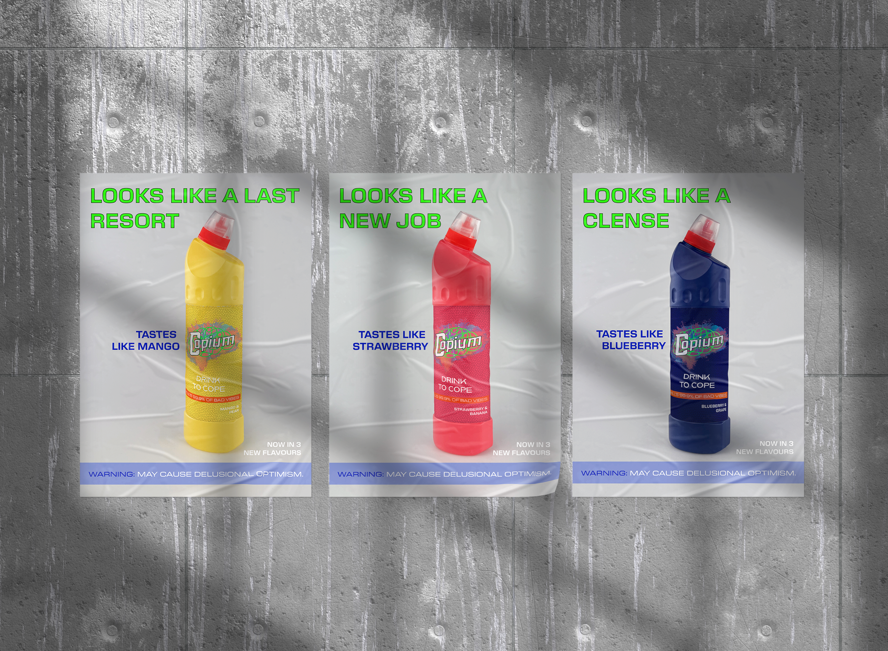
On the bottles’ label, the logo is designed in two different sizes, where one works to maintain visual associations with a bleach brand, the other clearly labels the contents of the bottle when tilted to drink.
The shape of the bottle forces the drinker to consume it at an exaggerated angle. This angle allows the larger logo to be clearly visible above the drinker, further promoting the brands’ satiric humour to others around the drinker.
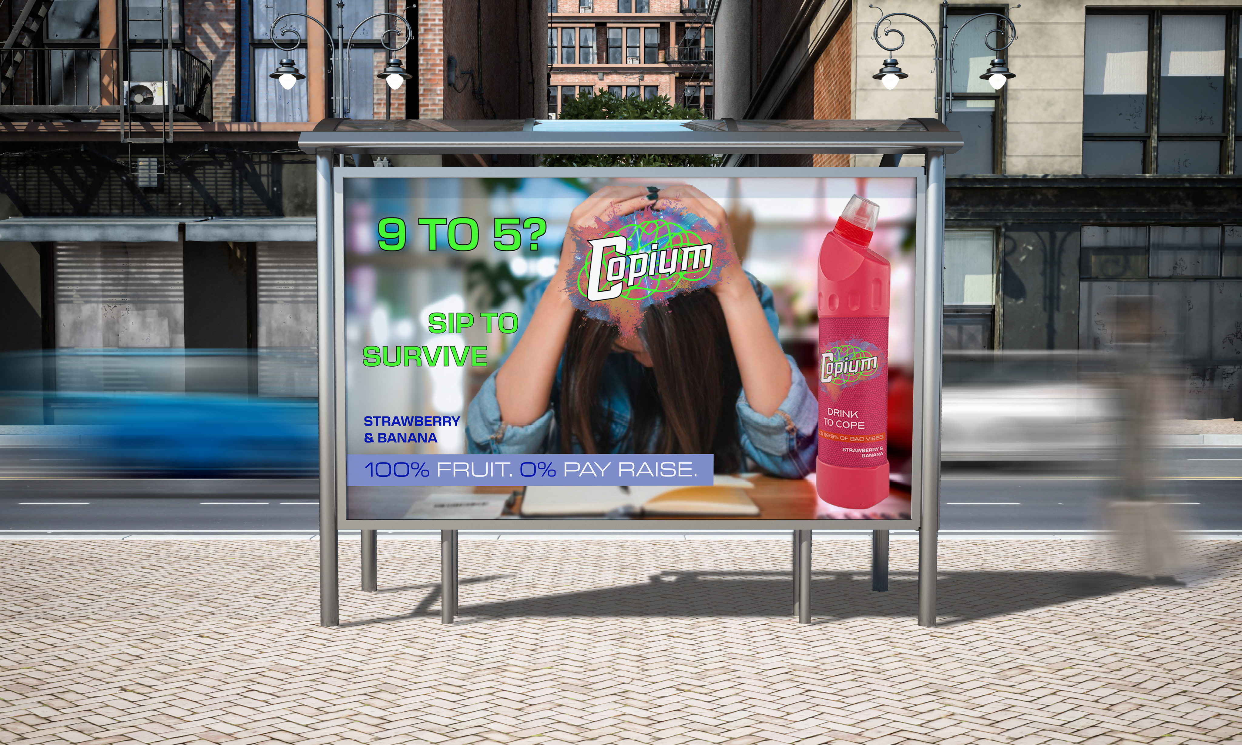
Copium
My task was to design a non-alcoholic drinks brand, targeting young adults. The purpose of the brief was to explore creative branding ideas.
Inspired by meme culture and healthy eating, the idea is centred around selling a fruit smoothie in a bleach bottle and marketing it as “Copium” - a satirical remedy for coping.
The branding works by creating strong visual associations to bleach in its packaging, thanks to the use of layout and shape of a Domestos bottle. These associations combined with a fresh logo design, come together to create a striking brand which, not only captivates, but also, through its satirical nature and healthy content, helps the consumer cope.
On the bottles’ label, the logo is designed in two different sizes, where one works to maintain visual associations with a bleach brand, the other clearly labels the contents of the bottle when tilted to drink.
The shape of the bottle forces the drinker to consume it at an exaggerated angle. This angle allows the larger logo to be clearly visible above the drinker, further promoting the brands’ satiric humour to others around the drinker.